Category Archives: Ink Reviews

Diamine Music Ink Set!

Standard

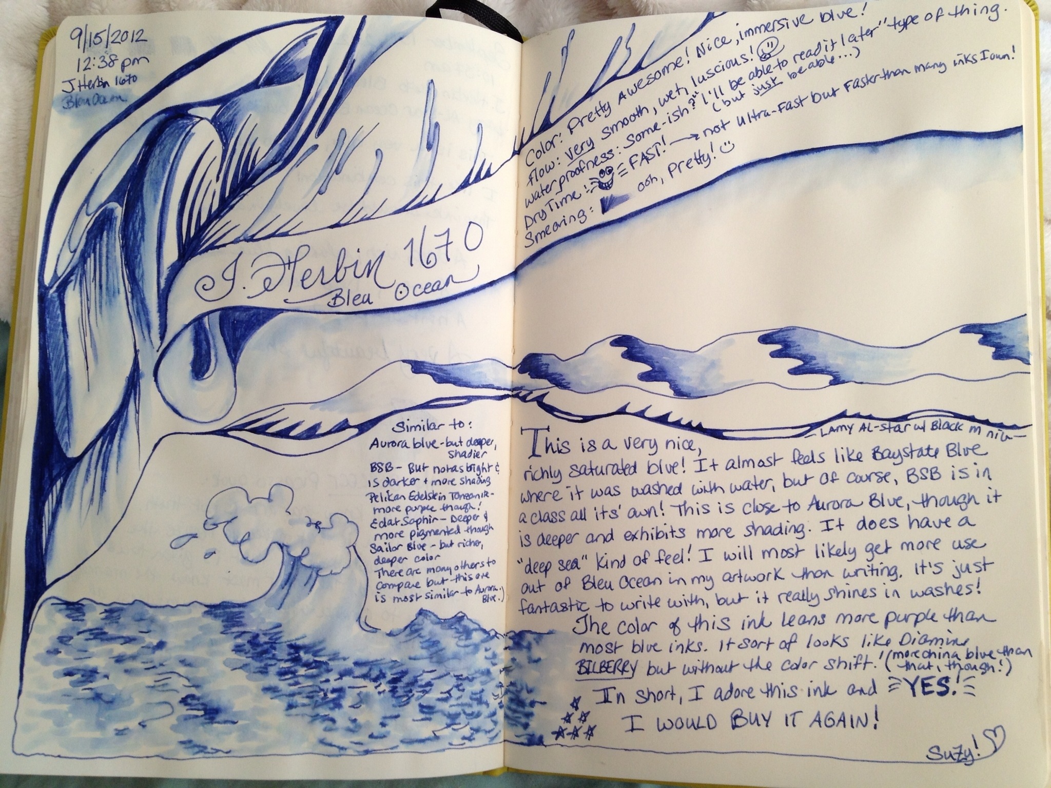
What’s better than one new Diamine ink? TEN of them! Yes, thanks to the wonderful people at Goulet Pens, my Diamine Music set arrived today! It took me about 1.4 milliseconds to open the box, ink up the nearest ten pens and get to writing! I will post more in-depth reviews on some of the inks in the coming days…but my first thoughts are: Beautiful set, FANTASTIC colors and (as expected) smooth, wet flow just like any other Diamine ink! Yes, if you do the math it is about $100 for $50 worth of ink. But this is some lovely ink! My only wish is that they’d sell “Handel” by the gallon! It’s beyond gorgeous!

20130131-142731.jpg

20130131-142805.jpg

20130131-142837.jpg

20130131-142816.jpg

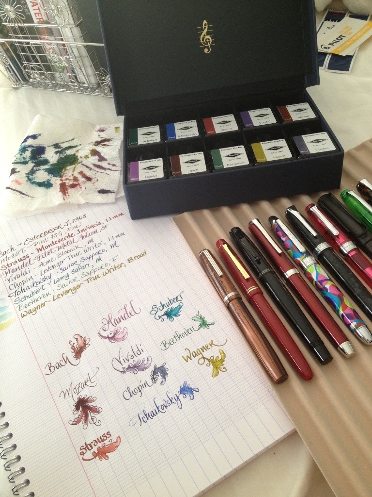
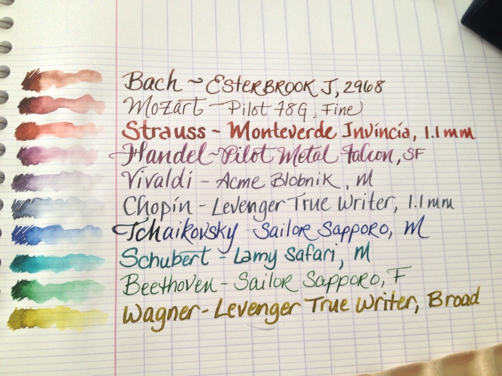
Hopefully, they will sell individual bottles sometime in the future. I could see myself going through the entire 30mL bottles of Handel, Wagner and Vivaldi very quickly!

Did you get this set, too? I’d love to hear what you think of it!

🙂

Ink Review: Diamine Sepia

Standard

When I think of sepia ink, I think of a deep, rich walnut tone. Visions of antique documents and intricate scrimshaw come to mind. Diamine Sepia is different. It isn’t the color of centuries-old writing, but more the color of the parchment it’s written on. It is a gorgous, warm butterscotch shade. In fact, if it were my ink, I would have named it just that. Butterscotch. I can’t look at this ink without craving a butterscotch ice cream sundae, complete with crushed peanuts, fresh whipped cream and a cherry on top!

Now that I’m hungry, I’ll simply post my review and let you be the judge. Either way, it’s beautiful! A full bottle of this is definitely in my near future!

Diamine Sepia

Written with: Noodler’s Konrad Flex Pen & Kuretake brush pen w/water

Written on: Ivory Clairefontaine (Quo Vadis journal) & 32# HP inkjet paper, bright white

In Short: smooth flow, average dry time, mostly not waterproof, good shading with some haloing. I also noticed that it darkened up slightly as it dried overnight. Interesting!

20120927-114416.jpg
Let me know what you think!

Ink Review: J. Herbin 1670 Bleu Ocean

Image

Well, here we are! I haven’t blogged regularly for about two years, but I am back. It’s good to be back!

I really wasn’t planning on returning to blogging, but then I fell in love with fountain pens! I just couldn’t resist their charms. And, oh, the inks! Hundreds of pretty little bottles full of color, all waiting their turn to be made into artwork, journals, letters, announcements and more! They are all so different and so beautiful, it’s nearly impossible to choose which to buy first! (And as I think the Goulets can attest, I can never choose just one!)

After winning August’s Ink Drop Contest, I decided to head over to Goulet’s and make J. Herbin 1670 Bleu Ocean my prize!

Which brings me to the purpose of this post…My first “official” ink review! This ink just happens to be a shade I find so inspiring, I can’t help but review it. You will see that my style isn’t very formal. Formality was never my thing. This isn’t meant to be complete or scientific in any way. It is simply my “real world” test and spontaneous thoughts on the ink. So here we go!…

J. Herbin 1670 ink in Bleu Ocean
Written with a Lamy Al-Star with black M nib
Washes done with a Kuretake brush pen full of plain old tap water 😉
On ivory Clairefontaine paper (Blank Quo Vadis journal)
Why is this review on ivory paper instead of white, you ask? Well, there is no shortage of beautifully done ink reviews on white…but this is the paper I use most! 🙂

Without further ado, I present my review. Thanks for reading & comments are welcome!

20120916-173034.jpg